
I wanted to something that I found personal interest in, to help me be motivated to learn how work this site. Nothing motivates a person as does passion. I am very passionate about food. I always found it frustrating when commercials made the food look so good. Yet when I purchase the food, the item looks like something pulled from a dumpster (or close to it).
So I chose this advertising by McDonalds that was done by Ian David Mackenzie the Chief Creative Officer. The link below leads to his website where he showcases other ads he has done;
This ad and if you watch the video in the link, was meant to answer the question “why does the burger I buy, look so different than the ad”. They were able to answer that question and put their customers to ease, with a simple answer. That they use the same ingredients for both the ad and in the restaurants, but one was made by a professional food designer.
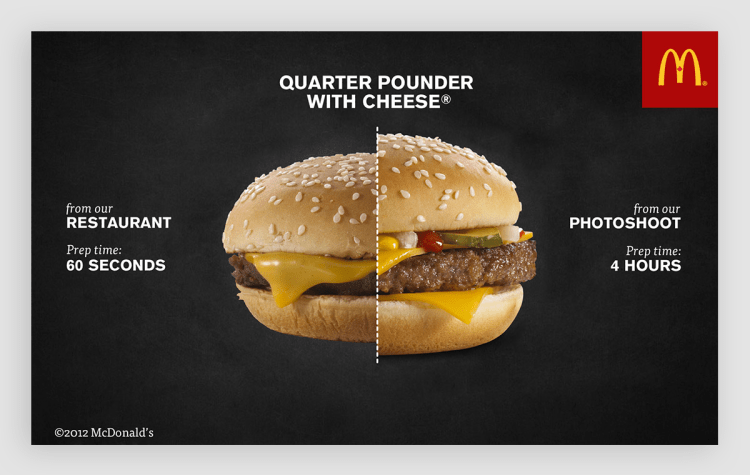
What I love most about this is the side by side comparison, and the time frame of how long it took to get the look of the burgers. The ad design is simple but very effective. They were able to get their statement across with very few words.
The biggest part of this ad that is being focused on is the center. Two burgers being compared to one another. The details of the burger make it easy to see how they contrast with one another. One burger is smaller, doesn’t look as fresh, the only things visible are the cheese, burger and bun. The burger looks dry compared to the other. The burger on the right looks perfect. You can see two slices of cheese, pickles, onion, condiments, a juicy burger and large full bun.
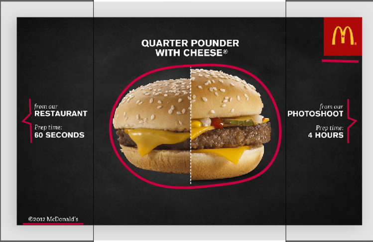
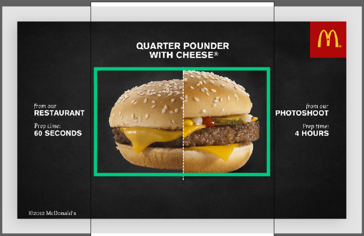
Here you can see the proximity or lack there of. The burgers are so close together to be able to compare easily. On the opposite sides of the ad is the descriptions of the burgers, the reason why they look the way they do. Then in opposite corners of the ad the logo for the franchise and the trademark. All are quit spaced apart, apart from the burger that is.
The majority of the ad is black in white. This is to draw attention to the middle were the burger is. So our eyes zoom in to what they are trying to get at. The burgers even have a difference in colors, the left is lacking, while the right has way more color.

We see that this ad used repetition a lot. With repetitive words, placing and pictures. There are; two pictures of burgers, two “from our” and “prep time” headings, how the burger has ingredients that overlap in the pictures. It’s a very effective way to show the difference by giving a side by side explanation of the burgers when the details are showed in the same way.
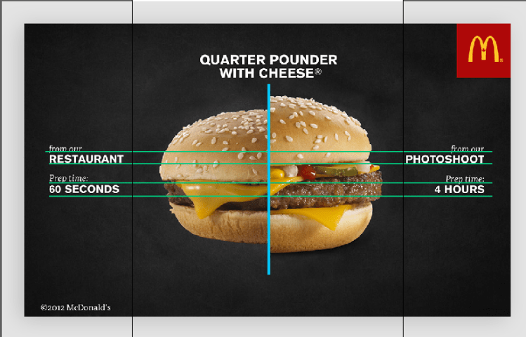
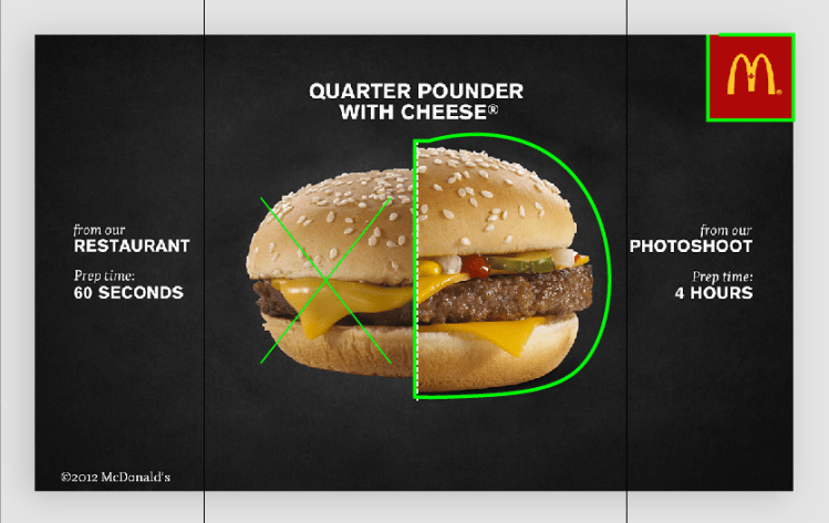
I think they did a great job with the alignment of this ad. They lined up the words directly across form each other. Even the burgeres lines up; the burger with the burger, cheese with the cheese, bottom bun with bottom bun.
Overall I think they did a really good job with this ad, even though I don’t like McDonalds, they do have a great advertising team.
