I am not a exercise buff or avid healthy eater. However I saw this magazine spread and thought it was very well done. It was created by Lindsay Marsh and uploaded on Aug 30, 2018. It was for a graphic designing class of her own. I thought it was a wonderful design with all the components that we were looking for in a magazine spread.
This is the link to her video that shows how she made this magazine spread; https://www.youtube.com/watch?v=hcqjFi0fpBc

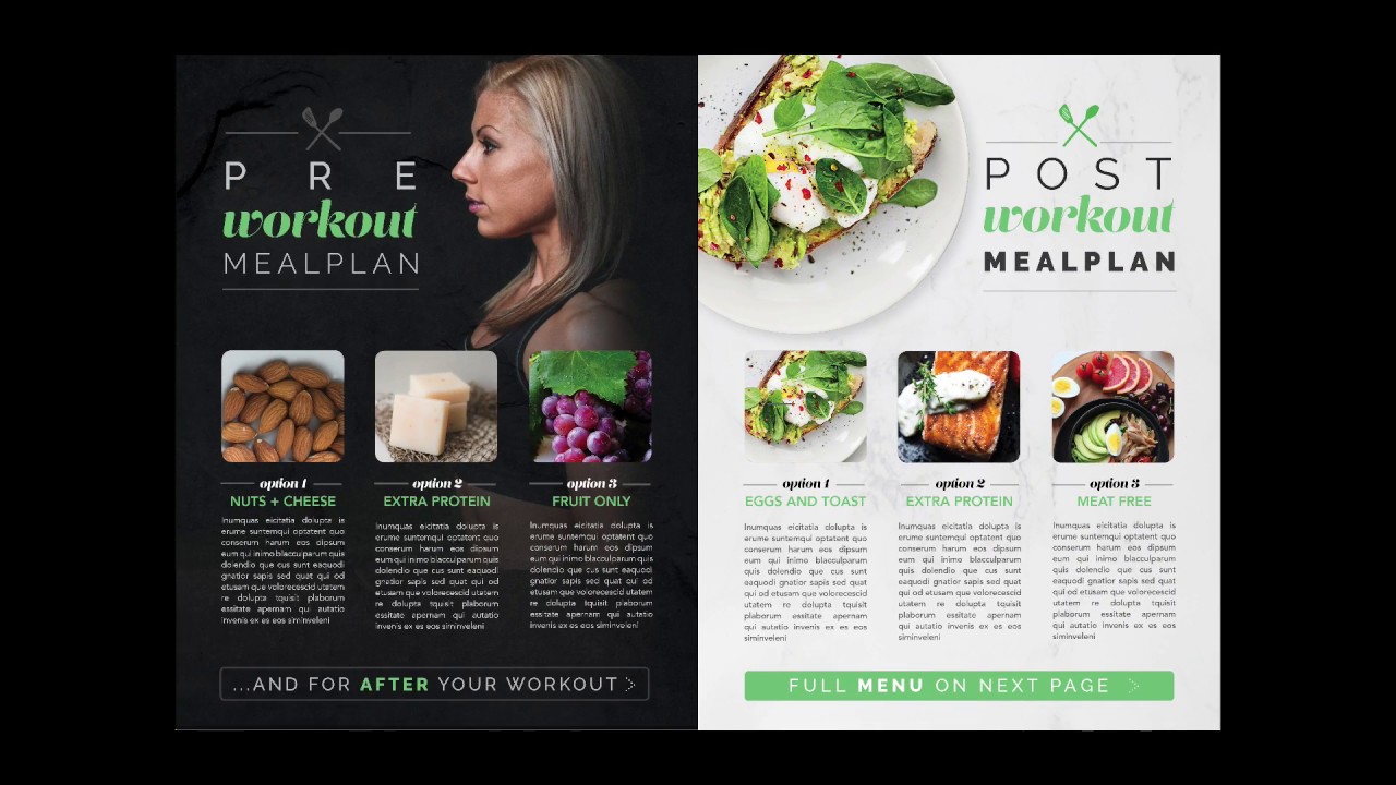
Categories of Typefaces
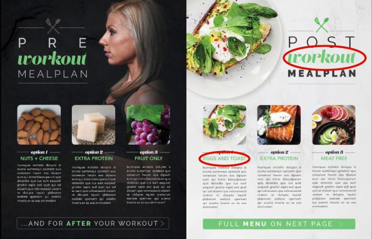
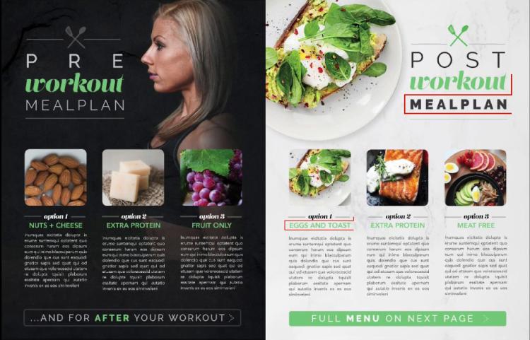
There are two main typeface categories that I want to focus on. The first is the Script typeface which can see is used for the word “Workout”. It looks like it could have been hand written with a pen, and it is also used sparingly. You see that they are artistically placed and not overwhelming. The second is Sans Serif. We can see it being used for the menu options like “EGGS AND TOAST”. The letters end with a sharp end without a serif. The lettering also lacks any thick to thin transitions.
Contrasting Elements
When looking at the test they can be very contrasting, the script looks very fluid and more natural to actual handwriting. Were as the Sans Serif looks very computerized text where everything is exact. Where the ad uses them in close proximity she also uses different color of text along with different size. Another thing that the designer did was to make one in all caps while the other is not making them contrast with each other.
Depth of Field and the Rule of Thirds
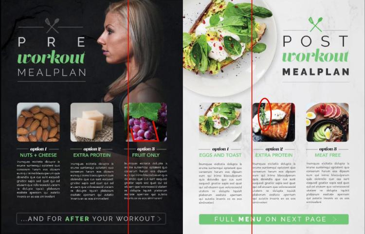
The rule of thirds is used on the largest image on the spread. It is of the woman facing sideways looking at the edge of the spread. You can see depth of field used in the images of food. Especially when looking at the grapes photo as you are looking at the bottom up to the top of the stem. You can also see it on the Salmon picture. The rosemary looks closer than the salmon


Summery
I am no photographer but the pictures below could be used for the fruit, protein and veggie pictures. They show good depth of field.


