Be yourself; Everyone else is already taken.
— Oscar Wilde.
Be yourself; Everyone else is already taken.
— Oscar Wilde.
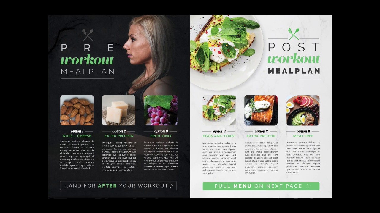
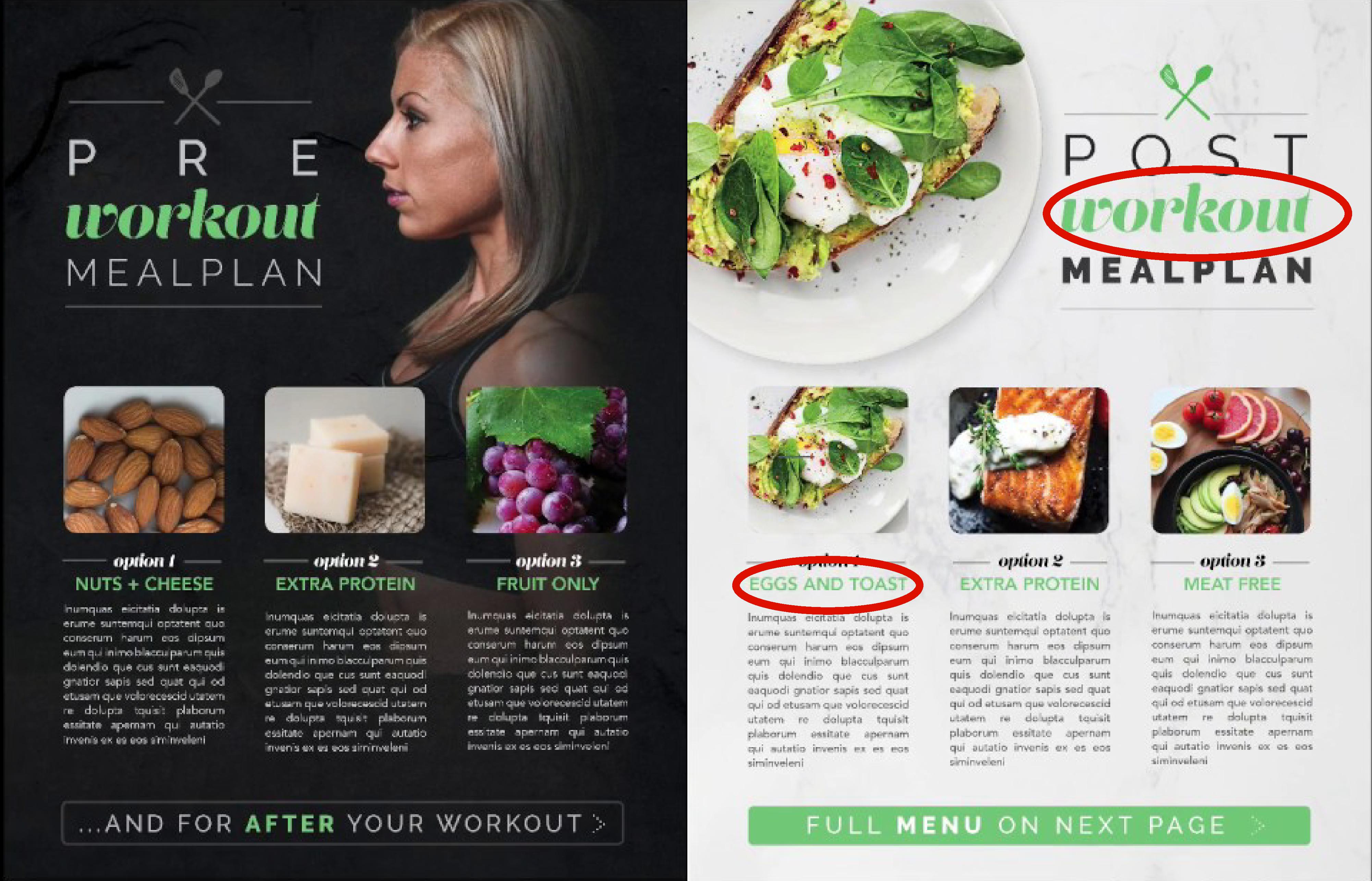
I am not a exercise buff or avid healthy eater. However I saw this magazine spread and thought it was very well done. It was created by Lindsay Marsh and uploaded on Aug 30, 2018. It was for a graphic designing class of her own. I thought it was a wonderful design with all the components that we were looking for in a magazine spread.
This is the link to her video that shows how she made this magazine spread; https://www.youtube.com/watch?v=hcqjFi0fpBc

Categories of Typefaces
There are two main typeface categories that I want to focus on. The first is the Script typeface which can see is used for the word “Workout”. It looks like it could have been hand written with a pen, and it is also used sparingly. You see that they are artistically placed and not overwhelming. The second is Sans Serif. We can see it being used for the menu options like “EGGS AND TOAST”. The letters end with a sharp end without a serif. The lettering also lacks any thick to thin transitions.
Contrasting Elements
When looking at the test they can be very contrasting, the script looks very fluid and more natural to actual handwriting. Were as the Sans Serif looks very computerized text where everything is exact. Where the ad uses them in close proximity she also uses different color of text along with different size. Another thing that the designer did was to make one in all caps while the other is not making them contrast with each other.
Depth of Field and the Rule of Thirds
The rule of thirds is used on the largest image on the spread. It is of the woman facing sideways looking at the edge of the spread. You can see depth of field used in the images of food. Especially when looking at the grapes photo as you are looking at the bottom up to the top of the stem. You can also see it on the Salmon picture. The rosemary looks closer than the salmon


Summery
I am no photographer but the pictures below could be used for the fruit, protein and veggie pictures. They show good depth of field.


I wanted to something that I found personal interest in, to help me be motivated to learn how work this site. Nothing motivates a person as does passion. I am very passionate about food. I always found it frustrating when commercials made the food look so good. Yet when I purchase the food, the item looks like something pulled from a dumpster (or close to it).
So I chose this advertising by McDonalds that was done by Ian David Mackenzie the Chief Creative Officer. The link below leads to his website where he showcases other ads he has done;
This ad and if you watch the video in the link, was meant to answer the question “why does the burger I buy, look so different than the ad”. They were able to answer that question and put their customers to ease, with a simple answer. That they use the same ingredients for both the ad and in the restaurants, but one was made by a professional food designer.

What I love most about this is the side by side comparison, and the time frame of how long it took to get the look of the burgers. The ad design is simple but very effective. They were able to get their statement across with very few words.
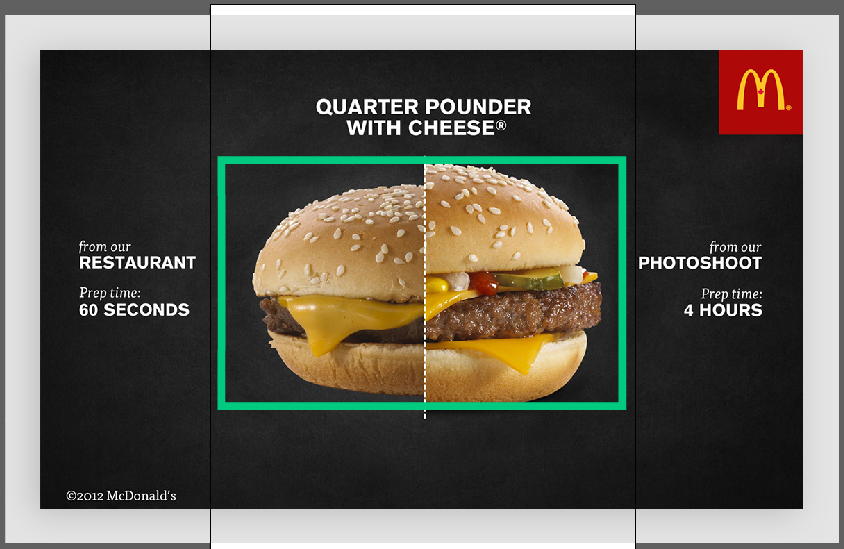
The biggest part of this ad that is being focused on is the center. Two burgers being compared to one another. The details of the burger make it easy to see how they contrast with one another. One burger is smaller, doesn’t look as fresh, the only things visible are the cheese, burger and bun. The burger looks dry compared to the other. The burger on the right looks perfect. You can see two slices of cheese, pickles, onion, condiments, a juicy burger and large full bun.
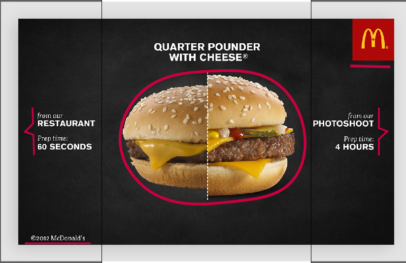
Here you can see the proximity or lack there of. The burgers are so close together to be able to compare easily. On the opposite sides of the ad is the descriptions of the burgers, the reason why they look the way they do. Then in opposite corners of the ad the logo for the franchise and the trademark. All are quit spaced apart, apart from the burger that is.
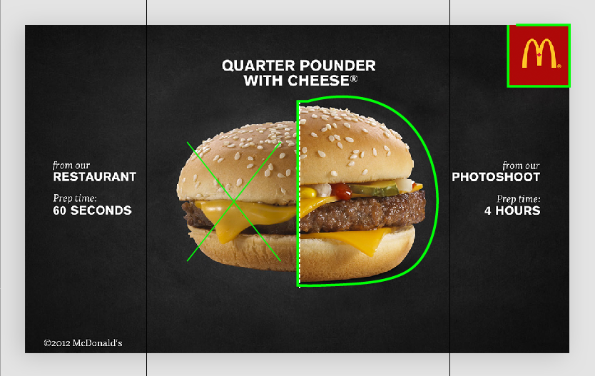
The majority of the ad is black in white. This is to draw attention to the middle were the burger is. So our eyes zoom in to what they are trying to get at. The burgers even have a difference in colors, the left is lacking, while the right has way more color.
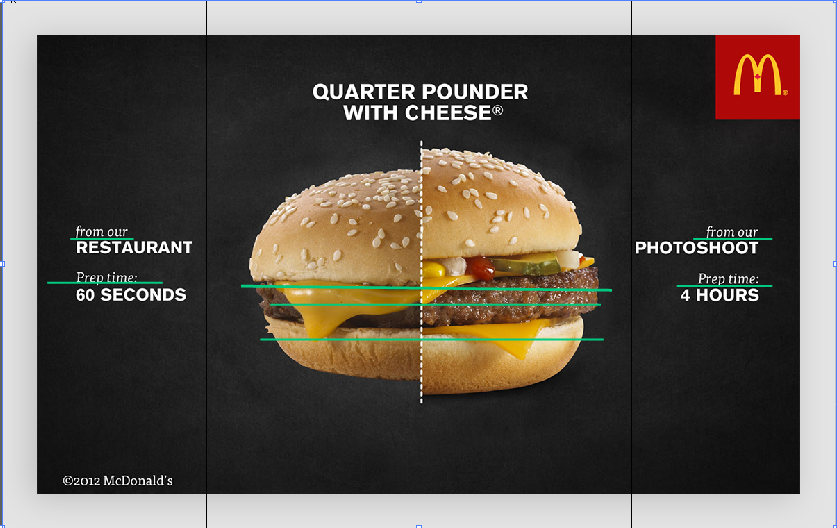
We see that this ad used repetition a lot. With repetitive words, placing and pictures. There are; two pictures of burgers, two “from our” and “prep time” headings, how the burger has ingredients that overlap in the pictures. It’s a very effective way to show the difference by giving a side by side explanation of the burgers when the details are showed in the same way.
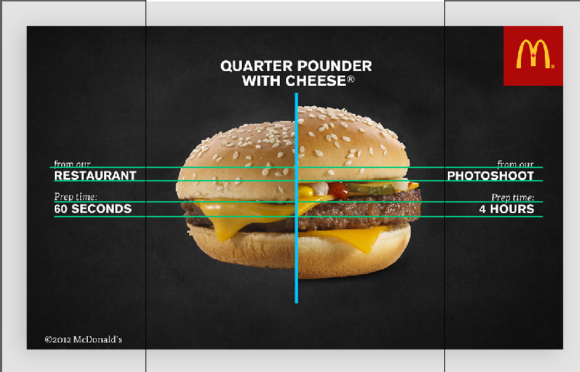
I think they did a great job with the alignment of this ad. They lined up the words directly across form each other. Even the burgeres lines up; the burger with the burger, cheese with the cheese, bottom bun with bottom bun.
Overall I think they did a really good job with this ad, even though I don’t like McDonalds, they do have a great advertising team.
This is an example post, originally published as part of Blogging University. Enroll in one of our ten programs, and start your blog right.
You’re going to publish a post today. Don’t worry about how your blog looks. Don’t worry if you haven’t given it a name yet, or you’re feeling overwhelmed. Just click the “New Post” button, and tell us why you’re here.
Why do this?
The post can be short or long, a personal intro to your life or a bloggy mission statement, a manifesto for the future or a simple outline of your the types of things you hope to publish.
To help you get started, here are a few questions:
You’re not locked into any of this; one of the wonderful things about blogs is how they constantly evolve as we learn, grow, and interact with one another — but it’s good to know where and why you started, and articulating your goals may just give you a few other post ideas.
Can’t think how to get started? Just write the first thing that pops into your head. Anne Lamott, author of a book on writing we love, says that you need to give yourself permission to write a “crappy first draft”. Anne makes a great point — just start writing, and worry about editing it later.
When you’re ready to publish, give your post three to five tags that describe your blog’s focus — writing, photography, fiction, parenting, food, cars, movies, sports, whatever. These tags will help others who care about your topics find you in the Reader. Make sure one of the tags is “zerotohero,” so other new bloggers can find you, too.
